For Affordable Apartment Markets, Little Rock has Best Value, New York Lowest
Axiometrics looked at 28 metro areas throughout the country to get an idea of which apartment markets had the most affordable rents in 2015, in the past and where they are expected to be the most affordable in the future.
How much of your income you spend on rent – your rent-to-household income ratio – is considered a good metric to assess apartment market affordability. Anything above 30% is considered unaffordable, since you will spend a significant percentage of your income on rent.
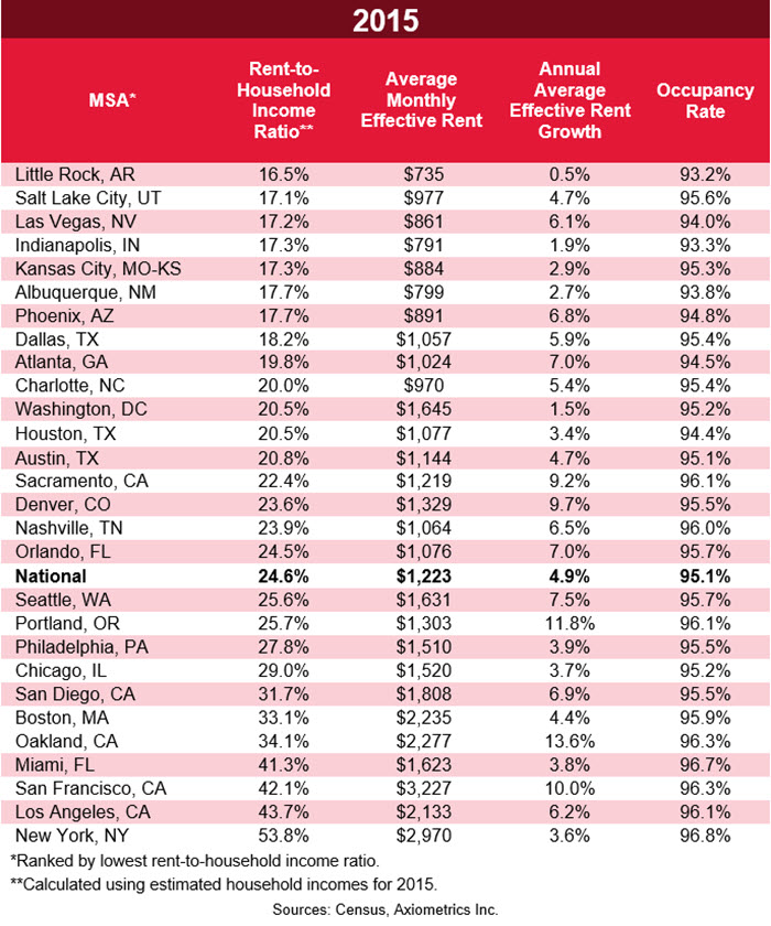
Using that ratio, the most affordable places to rent last year were Little Rock, Salt Lake City, Las Vegas and Indianapolis, according to Axiometrics’ apartment data.
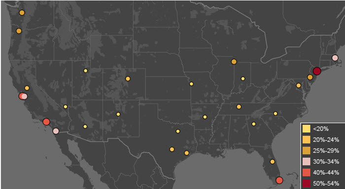
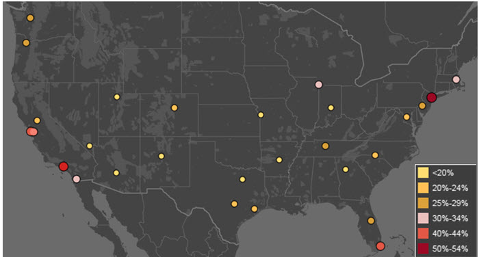
The map below shows the location of each of the 28 MSAs studied, represented as a dot.
Each dot is color-coded according to its 2015 rent-to-household income ratio. It ranges from light yellow for markets with a rent-to-income ratio less than 20%, to red for markets with ratios from 50-54%.
The least affordable markets are quite easily detectable by their larger, redder dots. New York was the least affordable in 2015, with a rent-to-income ratio of 53.8%. Los Angeles (43.7%) followed, then San Francisco (42.1%), Miami (41.3%) and Oakland (34.1%).
The full list, arranged by lowest rent-to-household income ratio, can be found below. It includes rent levels, along with growth and occupancy rates to get a better idea of each apartment market’s performance.
You may notice that a lot of the lower-occupancy MSAs also have lower rent-to-household income ratios; perhaps indicating more of a renter’s market where landlords can’t raise rents to the levels found in places like New York and Los Angeles.
Past Affordability
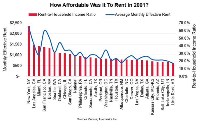
Historically, New York in 2001 was the least affordable metro of any of the 28 metros in any year since 1997. New York renters that year spent 66.0% of their household incomes on rent, which averaged $2,300.
This was around the time of the early 2000s recession (the “dot-com bust”), and New York job growth was -2.7%, so it’s no wonder affordability was an issue. This only includes market rents, so New York’s numerous rent-controlled apartments were not included in this data.
Little Rock renters had the best pricing situation in 2001, with monthly effective rent (rents minus concessions) averaging $617, with a rent-to-income ratio of 17.4%. The national average was 27.7% at this time.
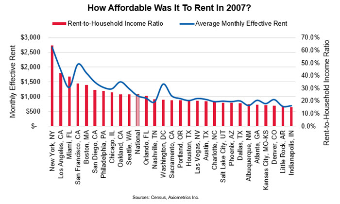
If you’re looking for the best time and place to be a renter in the past 20 years, the answer is Indianapolis in 2007. Monthly rents were $701, and your average Indianapolis renter only had to spend 15.2% of household income on rent. New Yorkers had the worst deal in 2007, with a rent-to-household income ratio of 64.0% — almost 40 percentage points above the 2007 national average of 24.9%.
2020 Vision
Looking ahead, Axiometrics expects the affordability map to look like this in 2020:
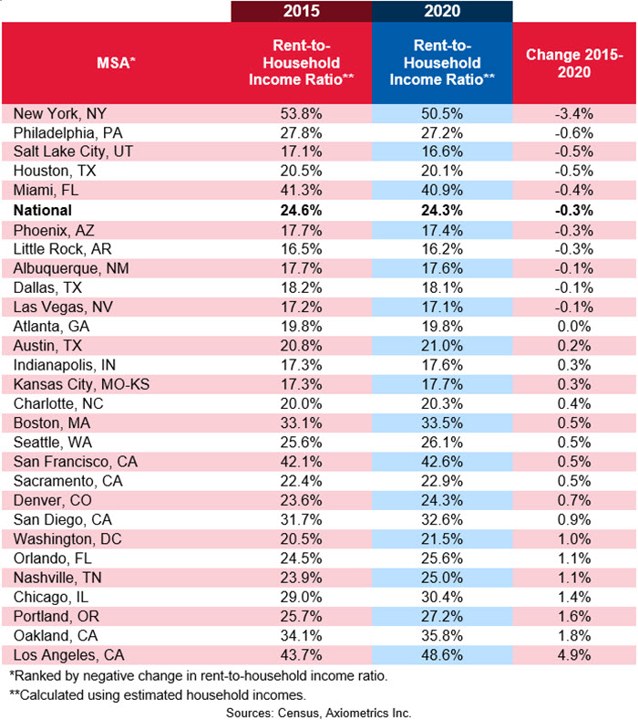
New York will remain the least affordable place to live, but renters will need to spend only 50.5% of their household incomes on rent, rather than the 53.8% of last year. Los Angeles is expected to become less affordable, with rents taking up an average 48.6% of households’ incomes.
Little Rock is expected to remain the most affordable place to live and to become even more affordable, as the rent-to-household income ratio goes from 16.5% in 2015 to 16.2% in 2020.
The table below gives an overview of each MSA’s 2015 rent-to-household income ratio and the expected change to 2020. The MSAs are ranked by largest negative change in rent-to-household income ratio.
The report was posted on AXIO Metrics Inc. and can be found HERE.


